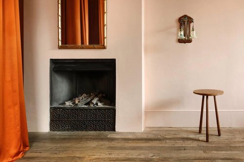
5 min read
WLLW's Guide to Mineral Paints
WLLW explores the category of mineral paints, and tests four that meet our requirements for creating healthy and sustainable interior spaces.
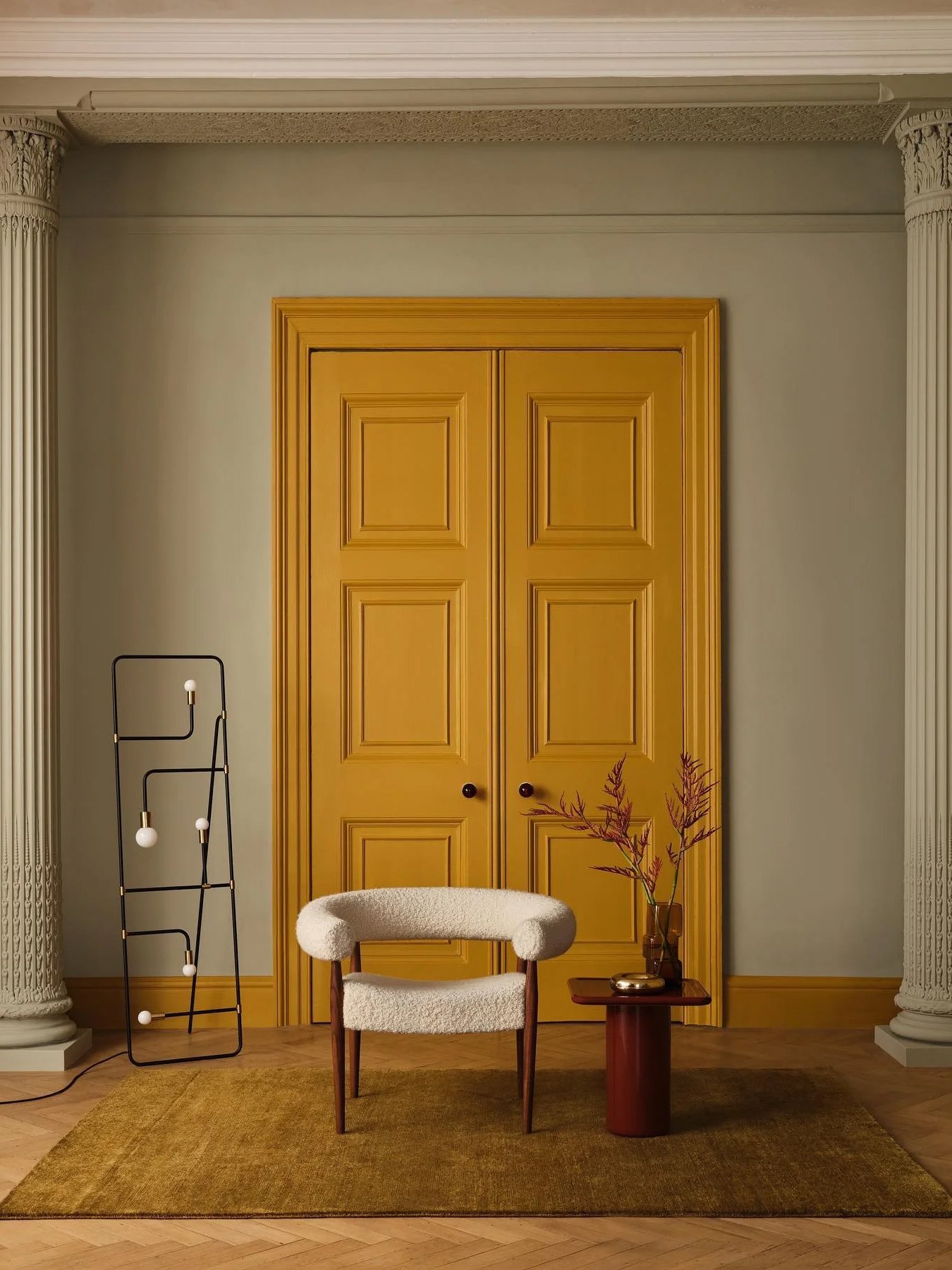
4 min read
In this introductory guide, WLLW explores the influence of color within the home and how it can transform your living space.
Navigating color in design can feel akin to standing at the edge of a kaleidoscopic ocean, where the depth of possibilities might inspire awe and trepidation in equal measure. The number varies from person to person; however, scientists estimate that on average, humans can distinguish up to 10 million different colors, each capable of evoking a complex set of emotions, solving spatial problems, and even influencing the energy levels of the room's inhabitants. This transformative power is grounded in the psychological effects of color and its ability to shape our perception and experience in a space.
For instance, lighter and cooler hues can make a room feel more expansive and airy, while darker shades tend to create a sense of intimacy and coziness. Color theory is one of the cornerstones of interior design. Along with considerations in texture, pattern and light, the conscious choice of color is essential in creating a room’s story and impact.
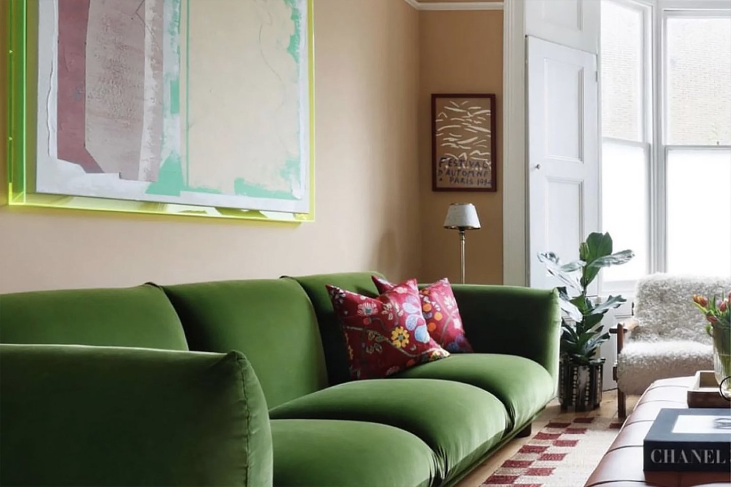
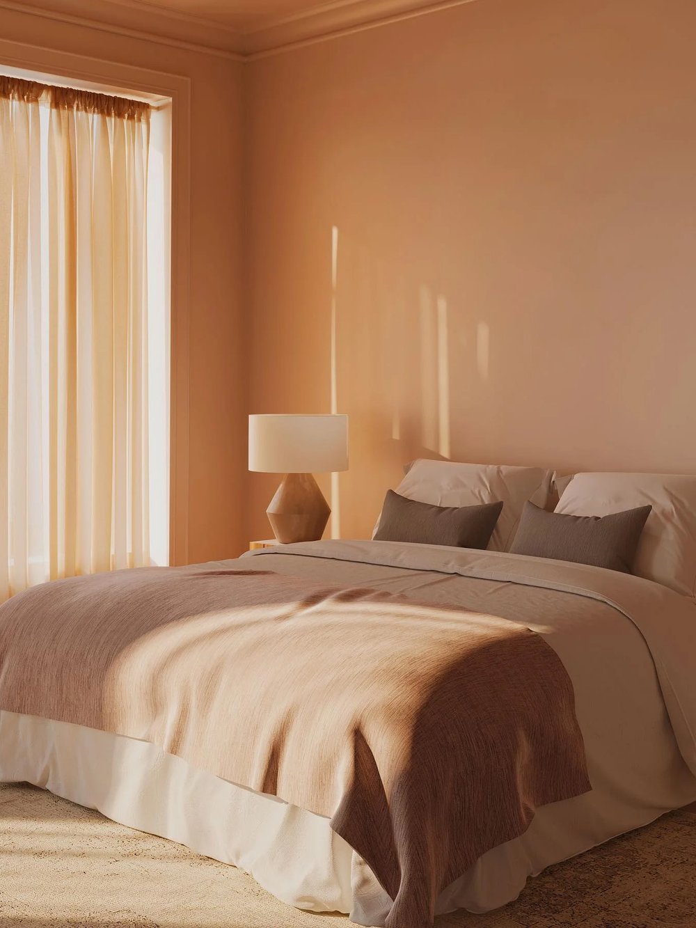
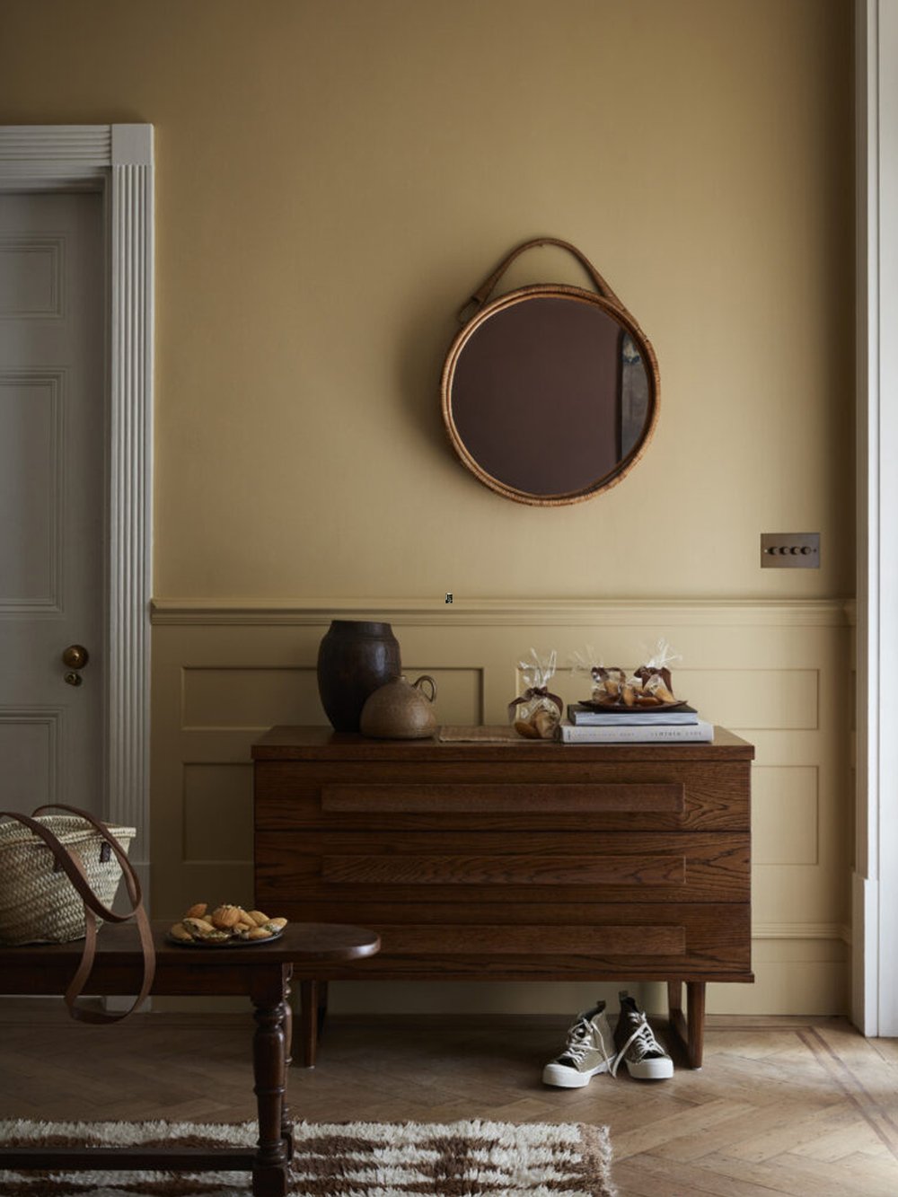
While popular color palettes can spark creativity, choosing colors should transcend the fleeting allure of seasonal trends. Colors should work in harmony with all the elements of design, including light, lines, form, patterns and space, reflecting instinct and personal expression first and foremost.
“Everyone is born a colorist because everyone has been exposed to and has a unique reaction to color.“
Langdon Graves, instructor of color theory at Parsons The New School of Design
Selecting colors for a space is a profoundly personal act of creativity. Instead of trending schemes, think about the intention behind the space – what activities it will host, how you want to feel and the overall ambiance and tone desired. Choose colors with personal significance, or which are inspired by natural elements, accessories or even a favorite piece of artwork, then use tools such as a color wheel to expand the palette.
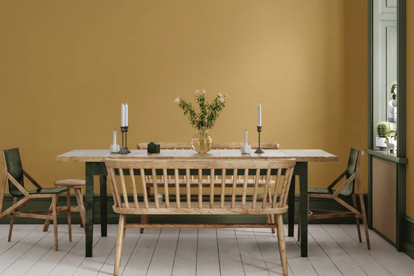
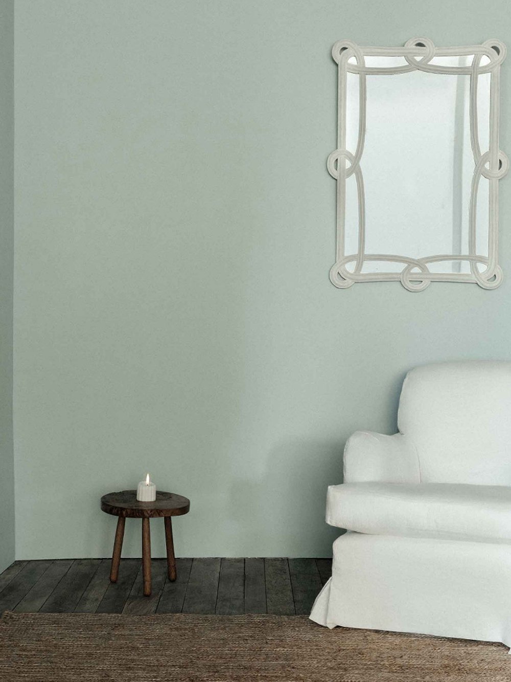
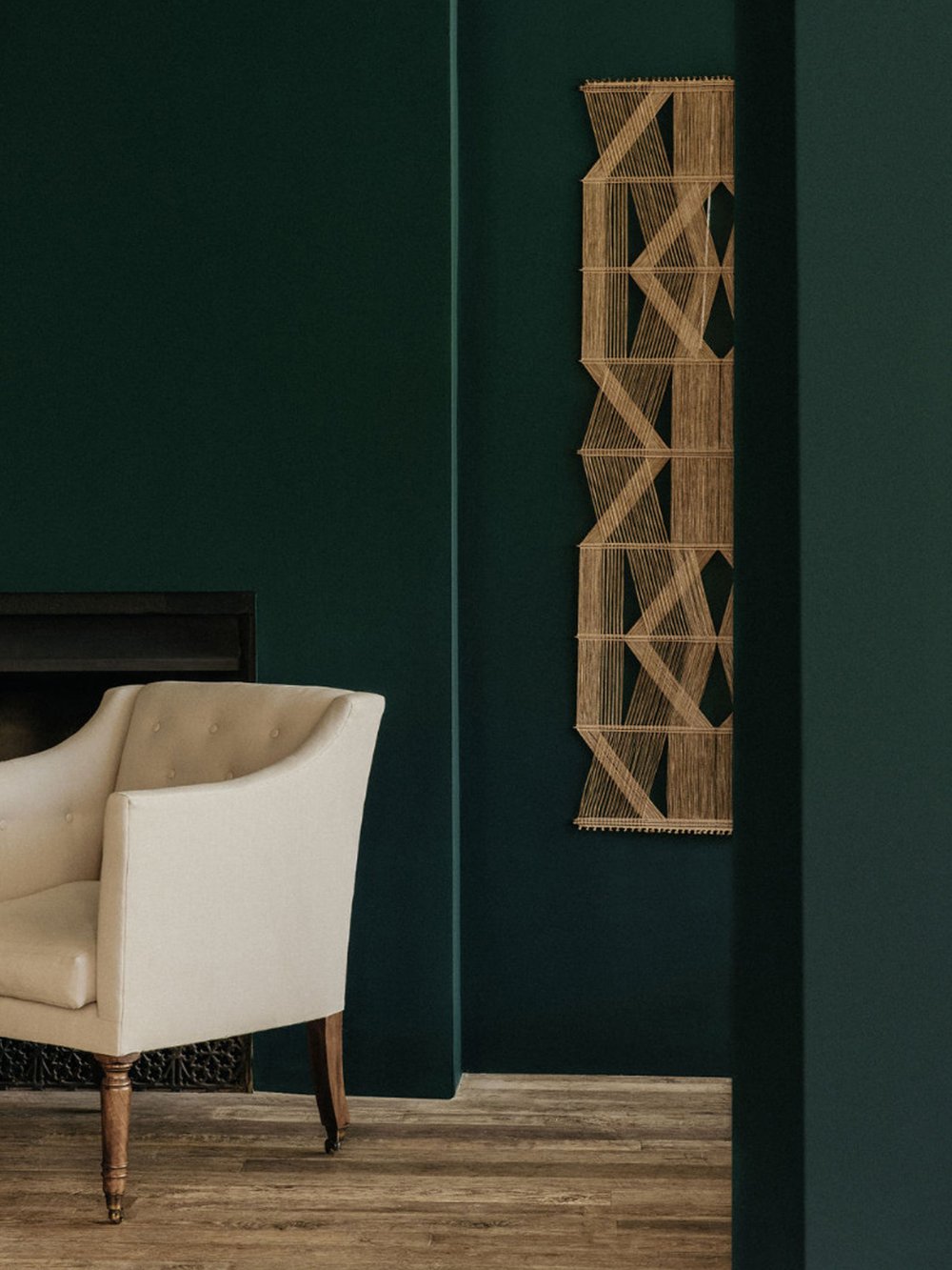
The classic color wheel is an essential design tool for understanding color relationships and can help to create harmonious combinations.
When it comes to overall balance a common design principle is the 60-30-10 color rule. This concept operates on the premise that the eye is naturally attracted to three varying levels of color: 60 percent background color, 30 percent contrasting color and 10 percent accent color. A palette using this ‘golden ratio’ can follow a number of schemes.
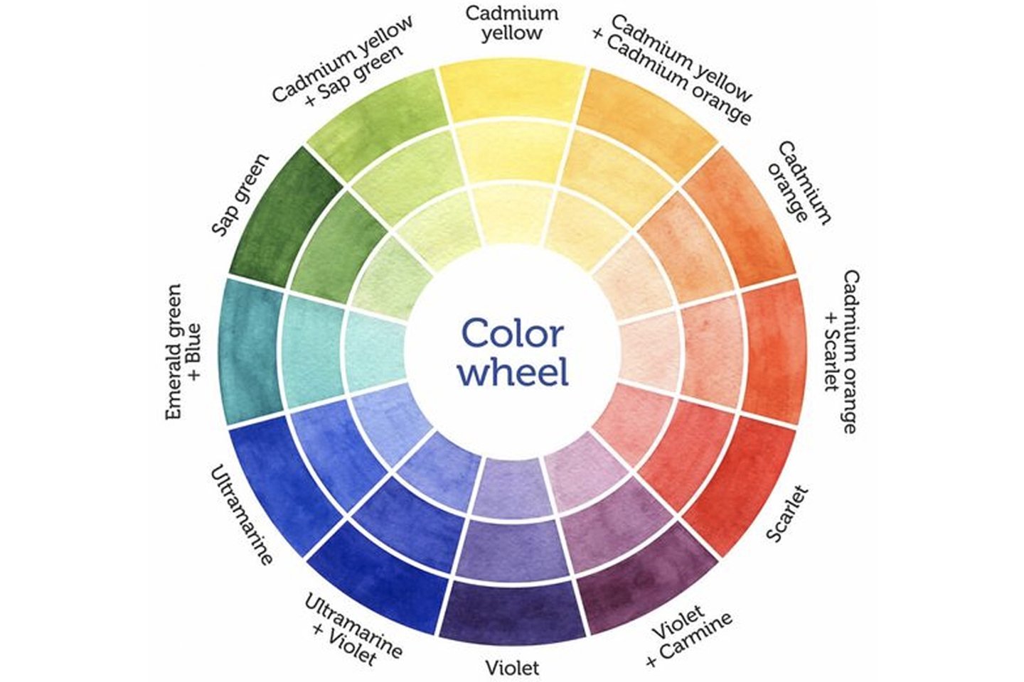
Monochromatic: Multiple tones from the same hue that create a monochromatic scheme.
Analogous: Created using colors next to each other on the color wheel.
Triadic: Hues that are spaced out equally on the color wheel.
Complementary: Colors on opposite sides of the wheel.
Tetradic: Variants of dual colors distributed evenly across the color wheel.
Split Complementary: Adjacent to the complementary color. For example, violet's complementary color is yellow, but its split complementary colors are yellow-green and yellow-orange.
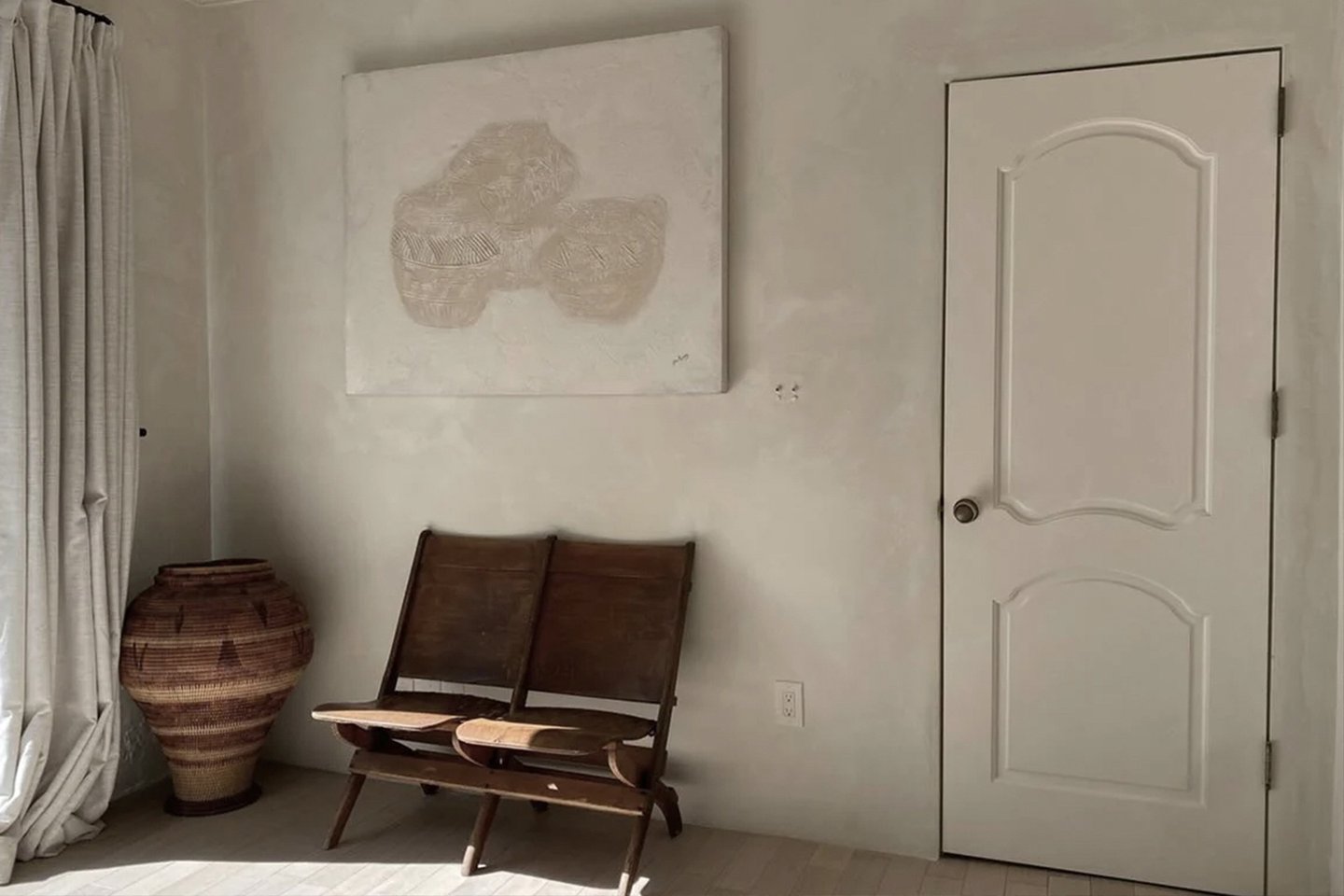
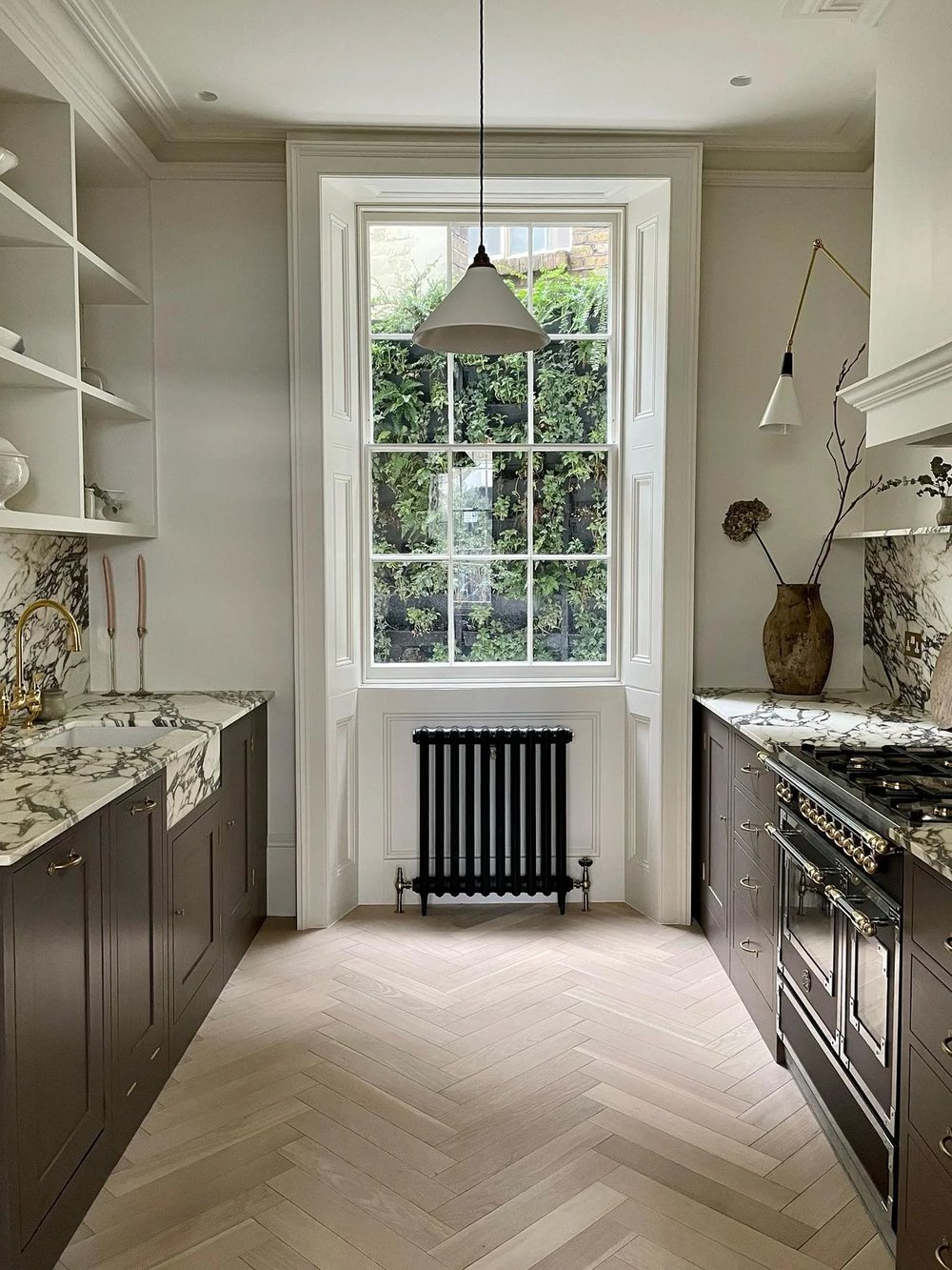
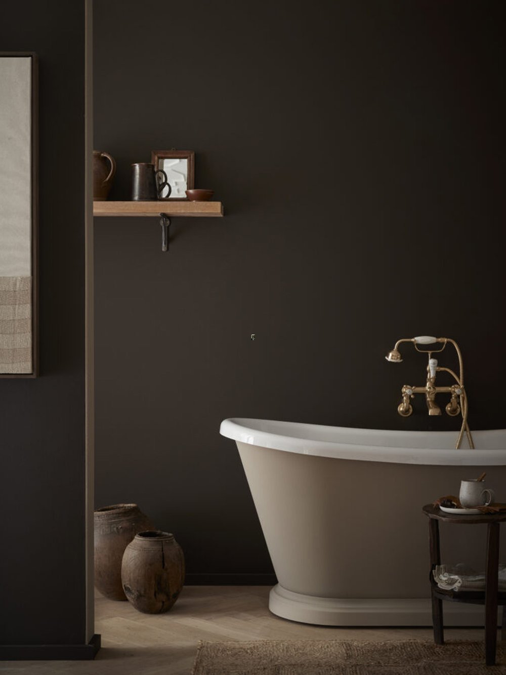
Light does more than just illuminate a room; the dynamic interplay between light and color can dramatically impact any space’s overall mood and atmosphere.
The intensity and shade of colors can shift noticeably based on the strength and direction of natural light, which varies with the weather, the time of year and the time of day. Morning daylight, for example, tends to emphasize cool colors, making them appear ethereal and tranquil, whereas the bright blue light around noon highlights whites and cool colors. Later in the day, the softer hues of sunset bring out warm colors and skin tones. North-facing rooms, which typically receive indirect sunlight, can make dark hues seem lighter, while soft colors can gain a radiant quality. This phenomenon underscores the importance of considering a room's orientation when making color choices for its interior.
This variation means that the same color can create a completely different ambiance at various points throughout the day. Studying the balance between warm and cool tones in natural light at different times is an excellent method for determining an accurate representation of the color in your space when it’s most used.
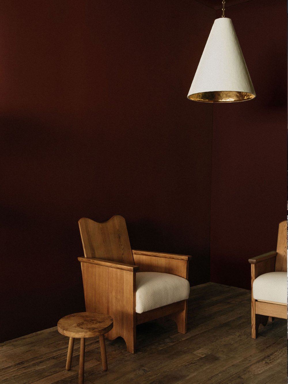
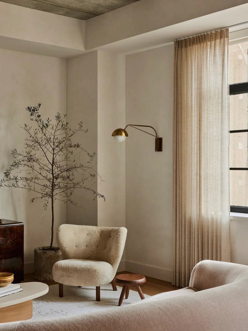
As you make selections for paint, finishes and materials, be sure to include sustainability in your decision-making process. Understanding the hidden toxins in the materials in your home is an important first step. Choosing low-VOC paints and low-impact textiles, both good for your health and the environment, is a great place to start.
Please contact WLLW’s studio which can help you source healthy and sustainable options for your home.
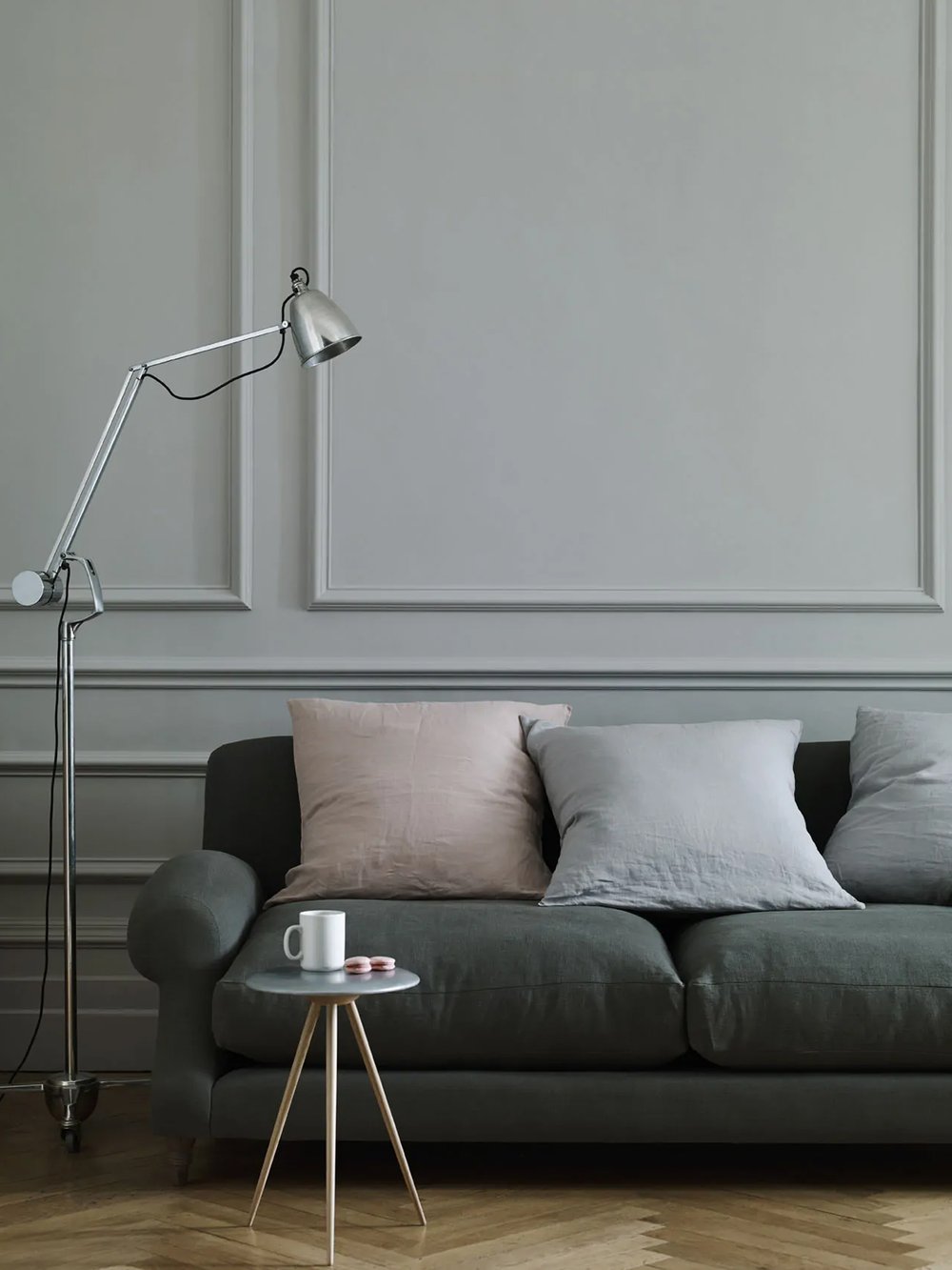
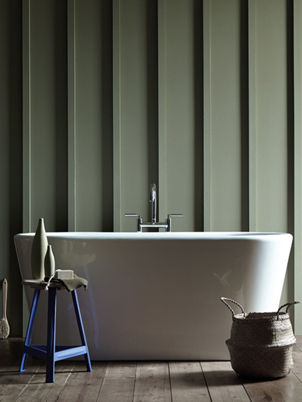
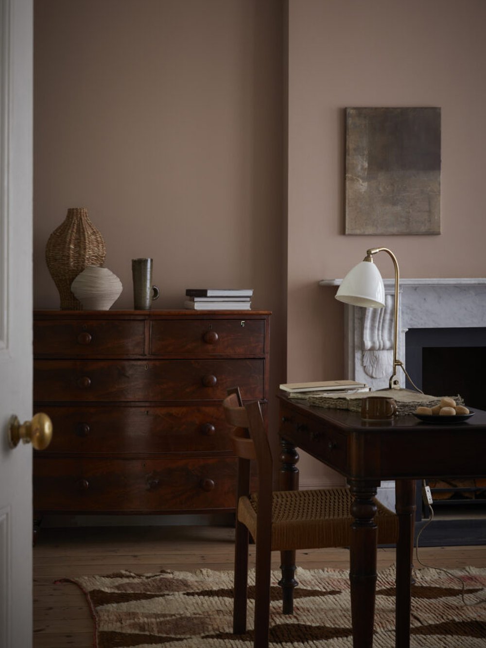
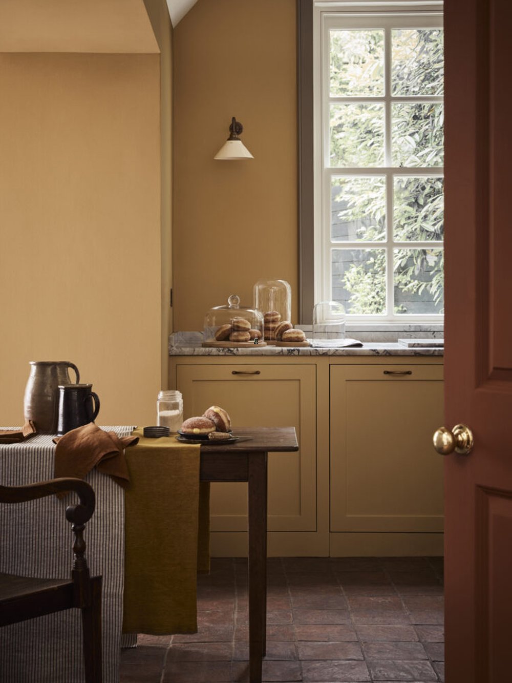
Photography: Graphenstone, Edward Bulmer, ECOS Paints, Little Greene, Rose Uniacke, Color Atelier Paint & Plaster, Plain English Design
Image: Color wheel by Irina Trumpe

5 min read
WLLW explores the category of mineral paints, and tests four that meet our requirements for creating healthy and sustainable interior spaces.

5 min read
Many paints can be hazardous both to human health and the environment. Here’s how to find a safe alternative.